#84 Interactive Infographic of the World
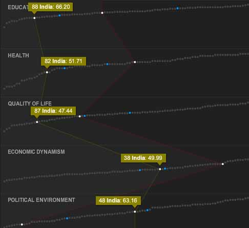
I am probably trailing behind a lot of people, certainly behind some of my students who just introduced me to a wonderful interactive site, called “The World’s Best Countries“. The very sophisticated interface and the tasteful graphics make it a real pleasure to enjoy profound data in categories such as health, education, quality of life, economic dynamism, or political environment – either by country, by region, or comparative. If you haven’t seen it yet, go visit.
January 7, 2013 @ 10:00 pm
I really like your post and the website you have suggested. First I looked at the data for Austria, my home country, because I was very intersted in the results. On the one hand I was a little bit disappointed that Germany is on the 12th place and Austria only on the 18th place but on the other hand there was a third country in which I was interested in and so I was glad to see that Finland is on the frist place because I am going to do an internship in Finland from February to May and it is good to know that they are so well-developed in every category.
I think this website is very good for companies who want to go abroad because the ranking and the different categories will give a very good overview about the economic and political situation and also about the social standarts. The website shows how developed the different countries are. These things are important when a company wants to build up a new location in an other country.
January 8, 2013 @ 7:57 pm
I also browsed through the site and found some interesting figures. Same as Alina, I looked at the country I am going to do a three months internship this year, which is the United Kingdom, and compared it to my home country Austria.
As the UK is on the 14th place when listing all countries, there is not so much difference to Austria, especially in the parameters health and quality of life. For me it is quite surprising, that Austria has better figures concerning the political environment. The UK is often presented as a very stable country due to the monarchy, but these figures say, that the democratic Austria has a higher stability.
I also compared these two countries concering Hofstede’s Dimensions. Power distance in the UK (PDI: 35) is higher than in Austria (PDI: 11), also is Individualism (IDV UK: 89 / AUT: 55). These figures match well with my experience with British business people. Through communication with my supervisor for the intership, I experienced a way of communication on the same level and the possibility to work creatively and individually, a way I am looking forward to. With a score of 66 in masculinity, the UK is a little less masculine oriented country than Austria (MAS: 79). I am curious, how this fact affects the daily (working) life. The low uncertainty avoidance in the UK (UAI: 35) shows, that the country is open for the new and unknown, in general. This fact is very interesting for me, as I am member of a young Austrian alternative rock band. As Austria is higher concerning uncertainty avoidance (UAI: 70), it could be easier to gain some publicity in the UK, as this is both the home country of alternative rock and a country that is more open to new alternatives and therefore maybe the right country for some promotion activities.
In my opinion the website you posted is very helpful to get an overview on some important figures, and the possibility for a direct comparison helps to get a clear summary. In combination with Hofstede’s dimensions, it could be very useful for companies who think about entering new markets, as some essential parameters can be researched and compared.